


DUDE WATAGRI 滑农兄弟 | Polar Opposites
The Challenge | Polar Opposites
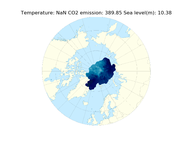
Arctic Visualization
We designed a local homepage to show the distribution of ice sheets and sea ice in Arctic region over the recent decade.
Summary
Within the two-day frame, we designed a local homepage to show the distribution of ice sheets and sea ice in Arctic region over the recent decade.
Team
We are a group of undergraduate, master and PhD students at the University of Waterloo majoring in Computer Science, Software Engineering, Electrical and Computer Engineering and Physics. We dedicatedly divided the tasks and collaborated well with each other to make the project work successfully and efficiently.
Methods
In this project, we obtained data on the position of ice sheets and sea ice (in the form of latitude and longitude) of each sea ice piece. We also extracted data on their thickness and calculated their shape therefrom. Then, we analyzed the data and built up a visualization tool to show the daily spatial changes in Arctic poles within the recent decade.
Based on the analysis on the daily changes in sea level and carbon dioxide, we demonstrated that, with the melting of glaciers, sea level has increased gradually with an average of 3.2mm of growth per year. The melting of glaciers might have some correspondence to the increasing concentration of carbon dioxide globally.
In terms of the programming language, we used HTML and Javascript to build up the front end and python as well as C++ to analyze and visualize the data.
Acknowledgements
The data were obtained from the following websites:
National Aeronautics and Space Administration Goddard Institute for Space Studies

SpaceApps is a NASA incubator innovation program.